Evaluation
Mid-Fi Critique
With established visual language, I created a set of mid-fidelity frames to maintain design flexibility while representing a more tangible look and feel.
I presented mid-fidelity wireframes to the Substantial design team during an internal critique session, adjusting product copy and design to provide a more streamlined, brand-oriented experience.
Tool Context Building
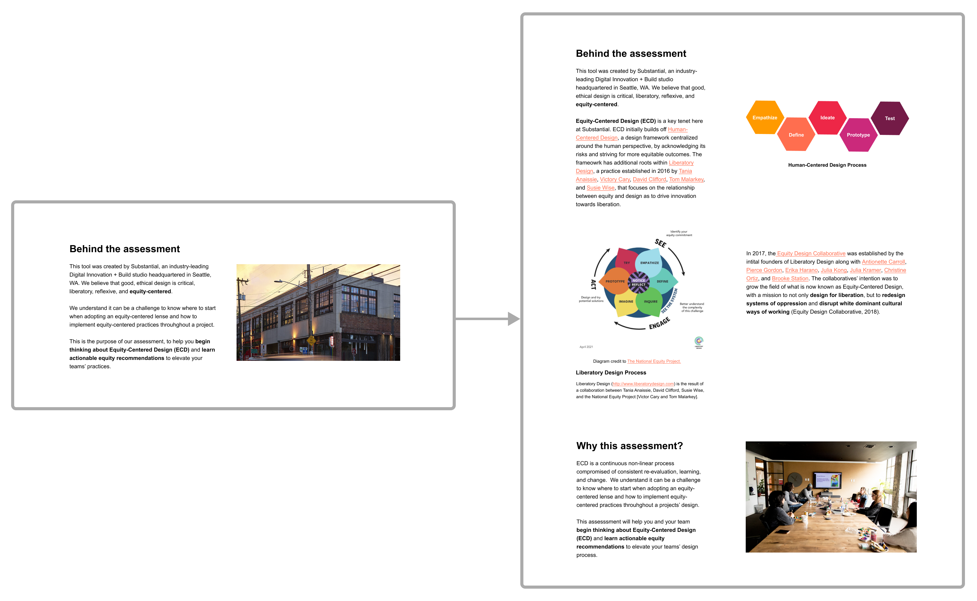
☝️Insight: Users must be able to build an understanding of ECD and the assessment to engage with the tool in a more intentional, informed manner.
✒️Action: Background information on ECD, supportive links, and custom visual aids.
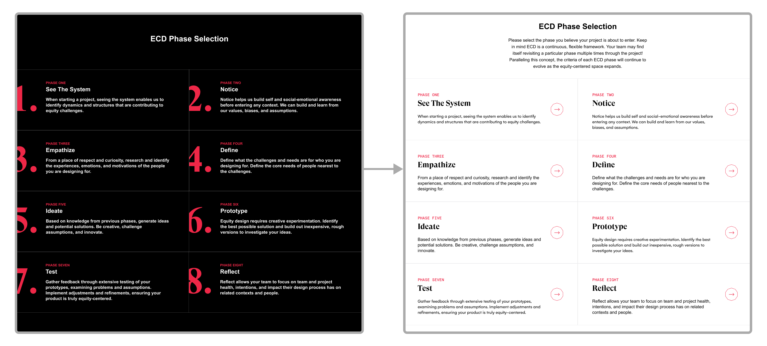
Phase Selection Pivoting
Hero Section Elevation
☝️Insight: Users should be offered a visually on-brand and guided experience to confidently select a design phase to assess maturity.
✒️Action: Section has instructional copy, arrow icons, larger headings, and light UI.
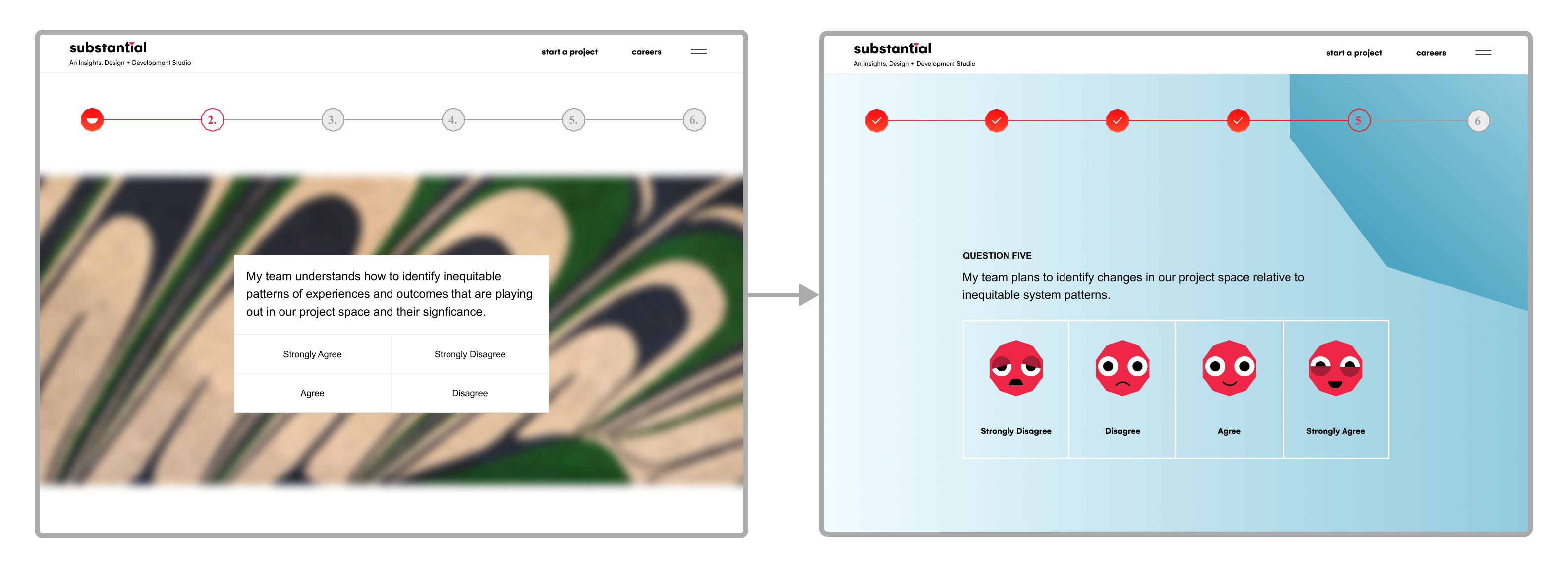
☝️Insight: Users should be presented a visually engaging, guided, and clean assessment experience to streamline input process and maintain high-quality, consistent design.
✒️Action: Singular gradient background, custom illustrated buttons building off Substantial logo, clear question headings, and check marks on progress bar.
Assessment Refinement
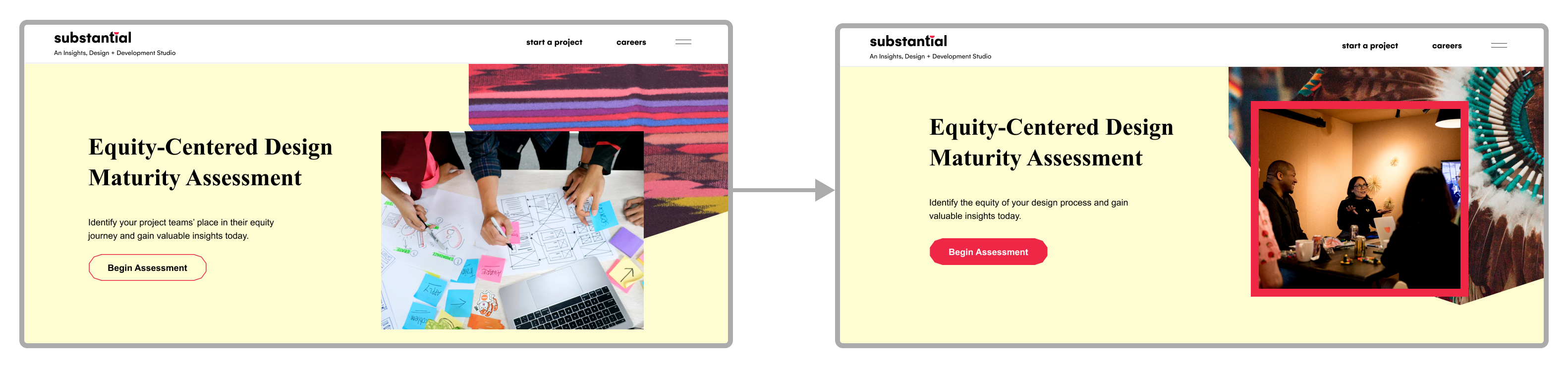
☝️Insight: Users must be able to easily identify where to begin the assessment and view personable visuals to facilitate a positive initial impression.
✒️Action: Primary button solid background & image of the Substantial team.
Maturity Tier Framing
☝️Insight: Users should be offered a slightly more supportive and positively framed maturity overview so they will feel encouraged to feedback and Substantial partnership.
🔮Future Work: Adjust maturity stage illustrations to not present as a deficit or absence, but intentionally crafted to be welcoming, supportive, and objective.


.png)


.png)


%20Intro.png)