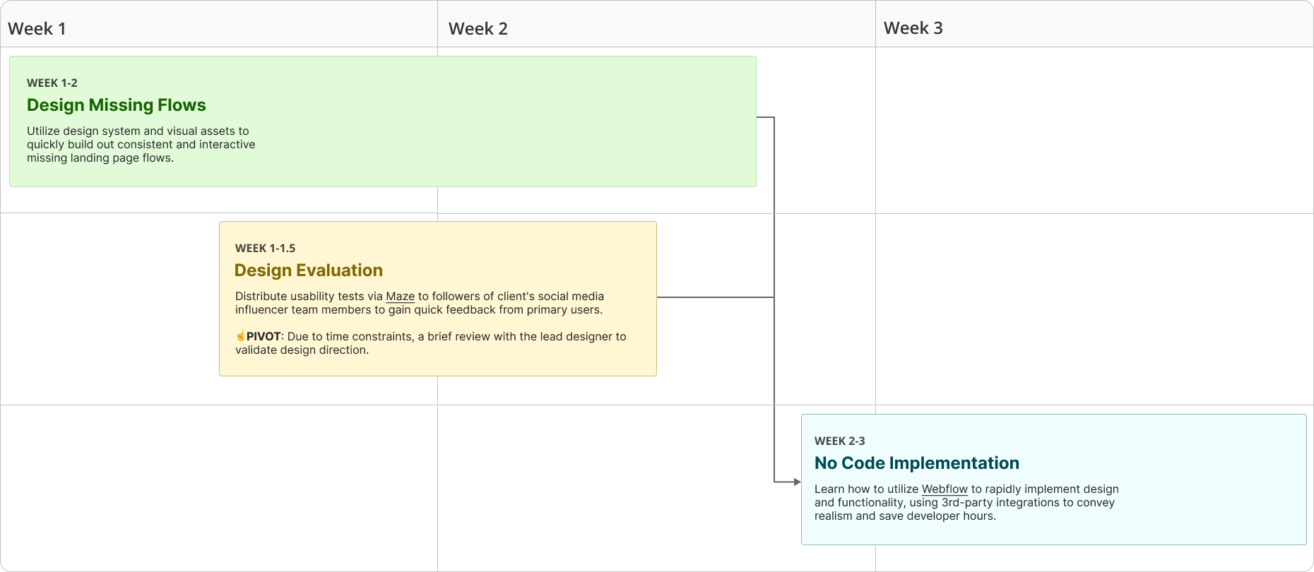
Highlight
Before
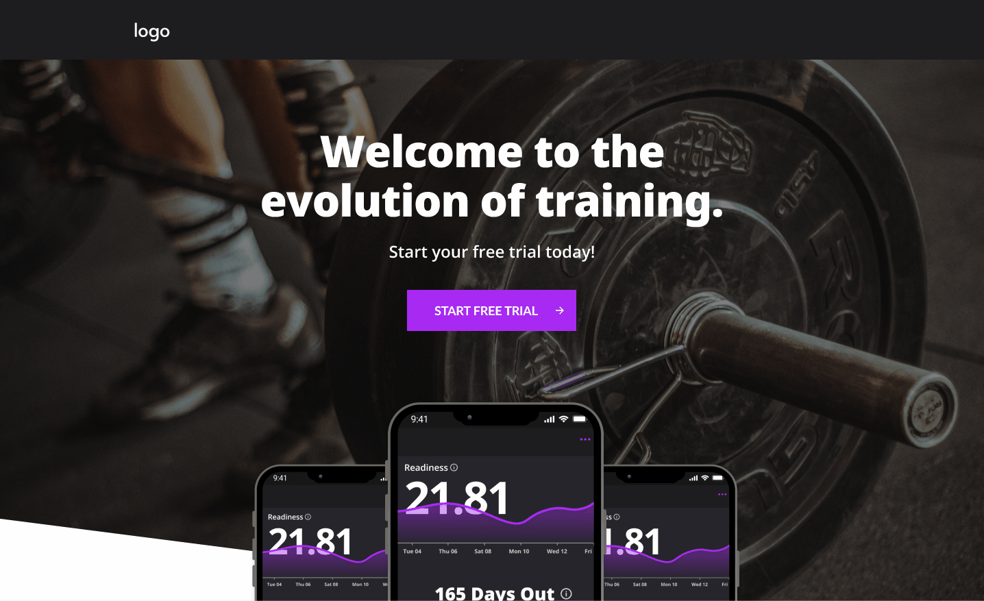
The lead designer had drafted a landing page in Figma using the style guide and design system. However, the subscription flow and app download path were not represented, and the static wireframes lacked interactivity. This gave the client less clarity on the product’s flow and entry points.
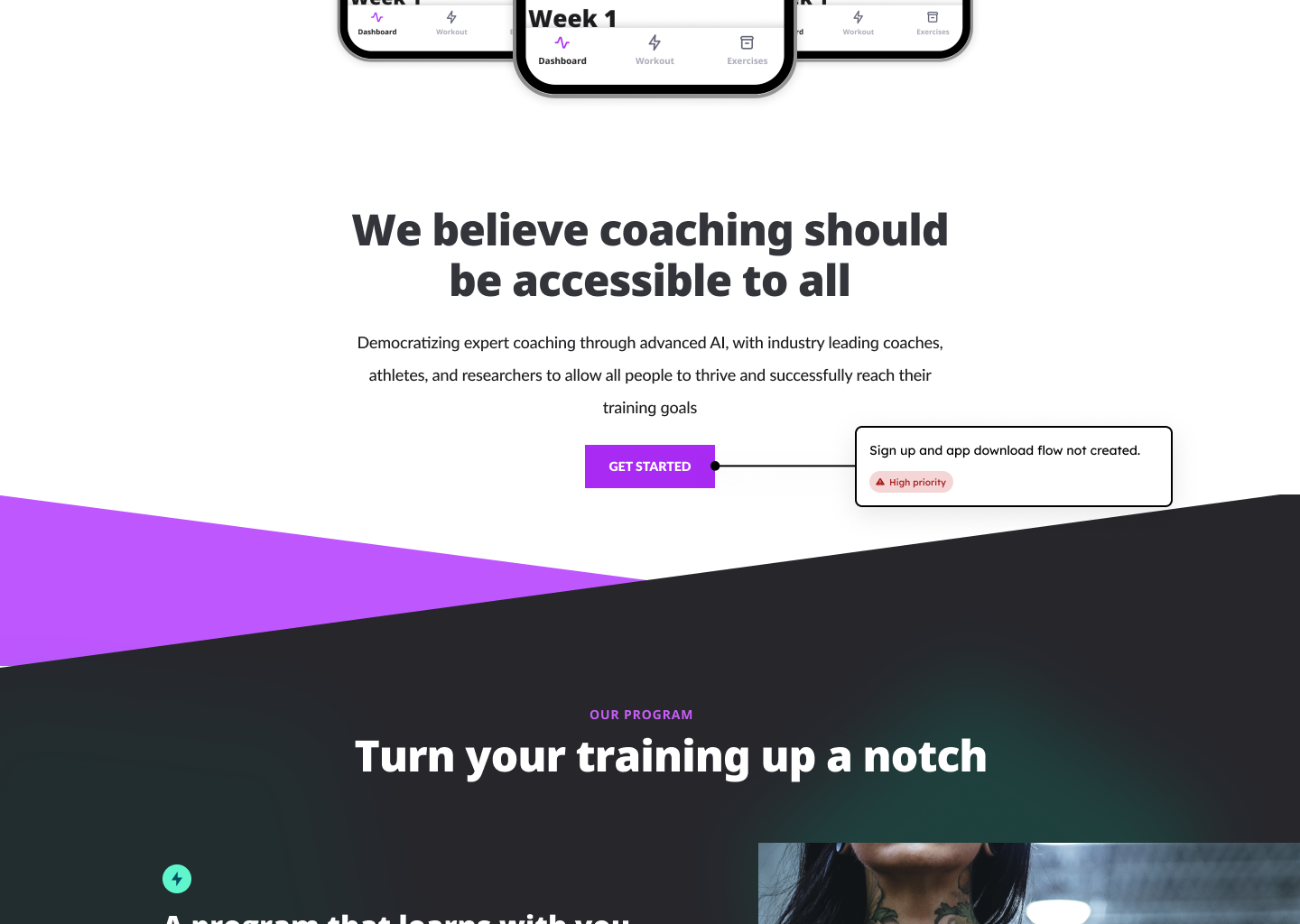
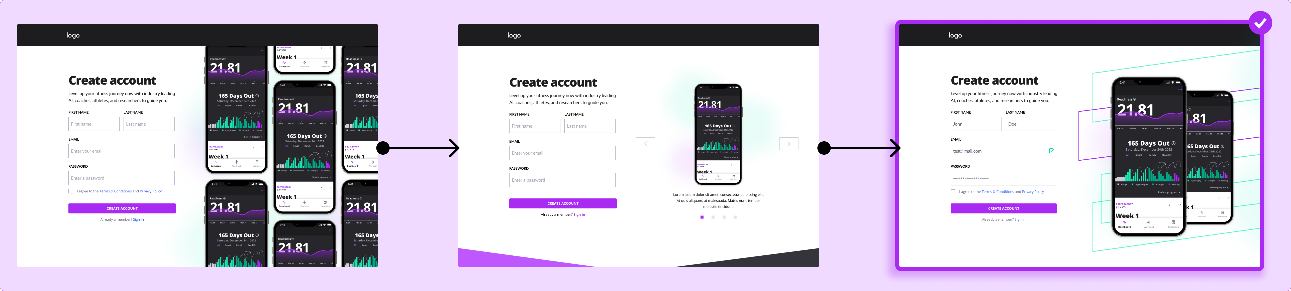
No sign up and download flow
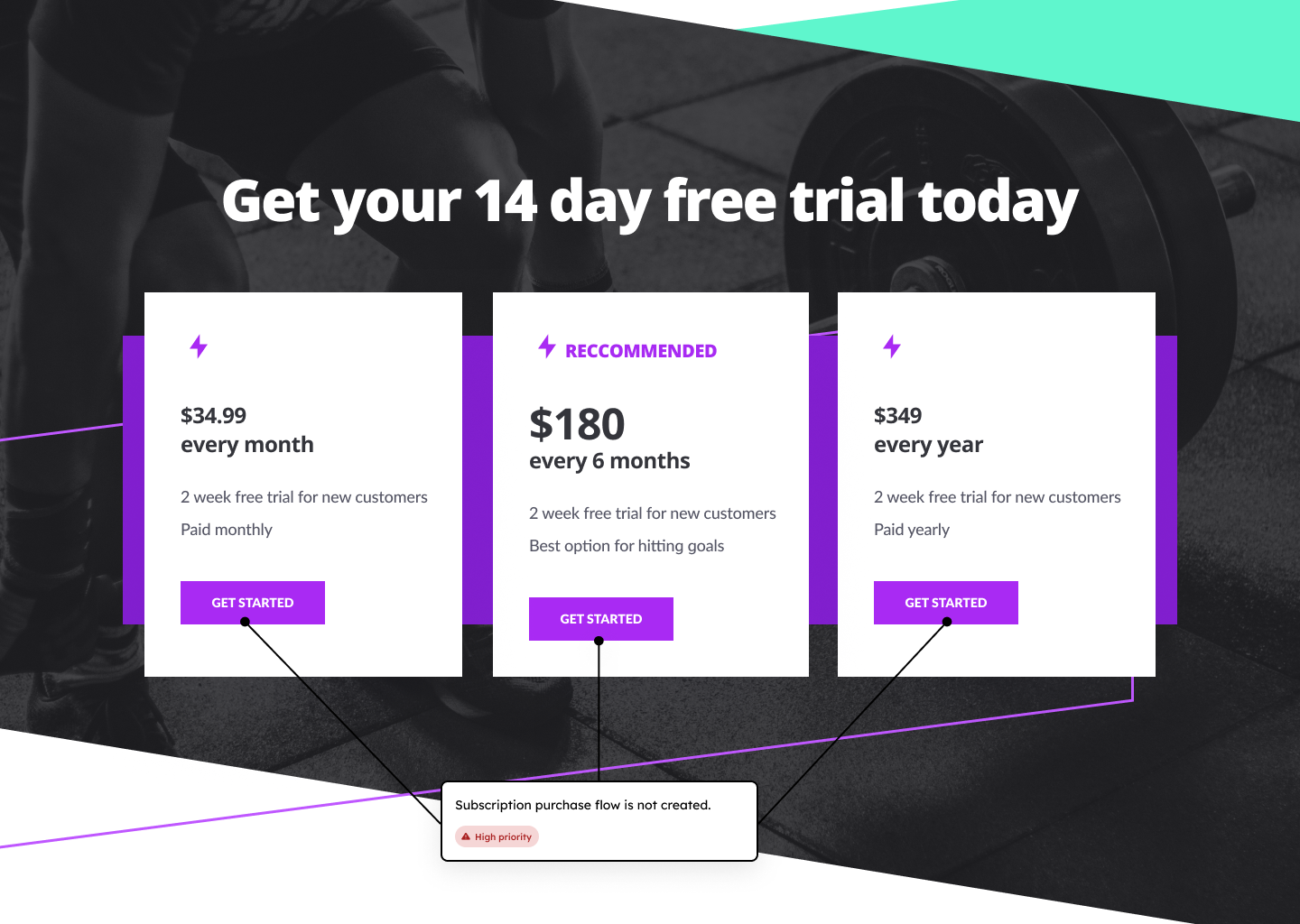
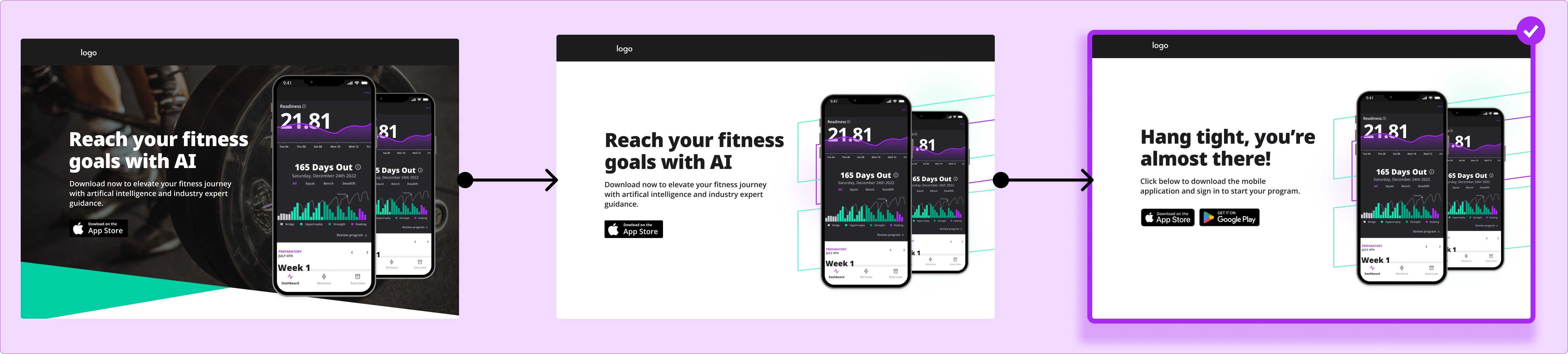
No subscription purchase flow
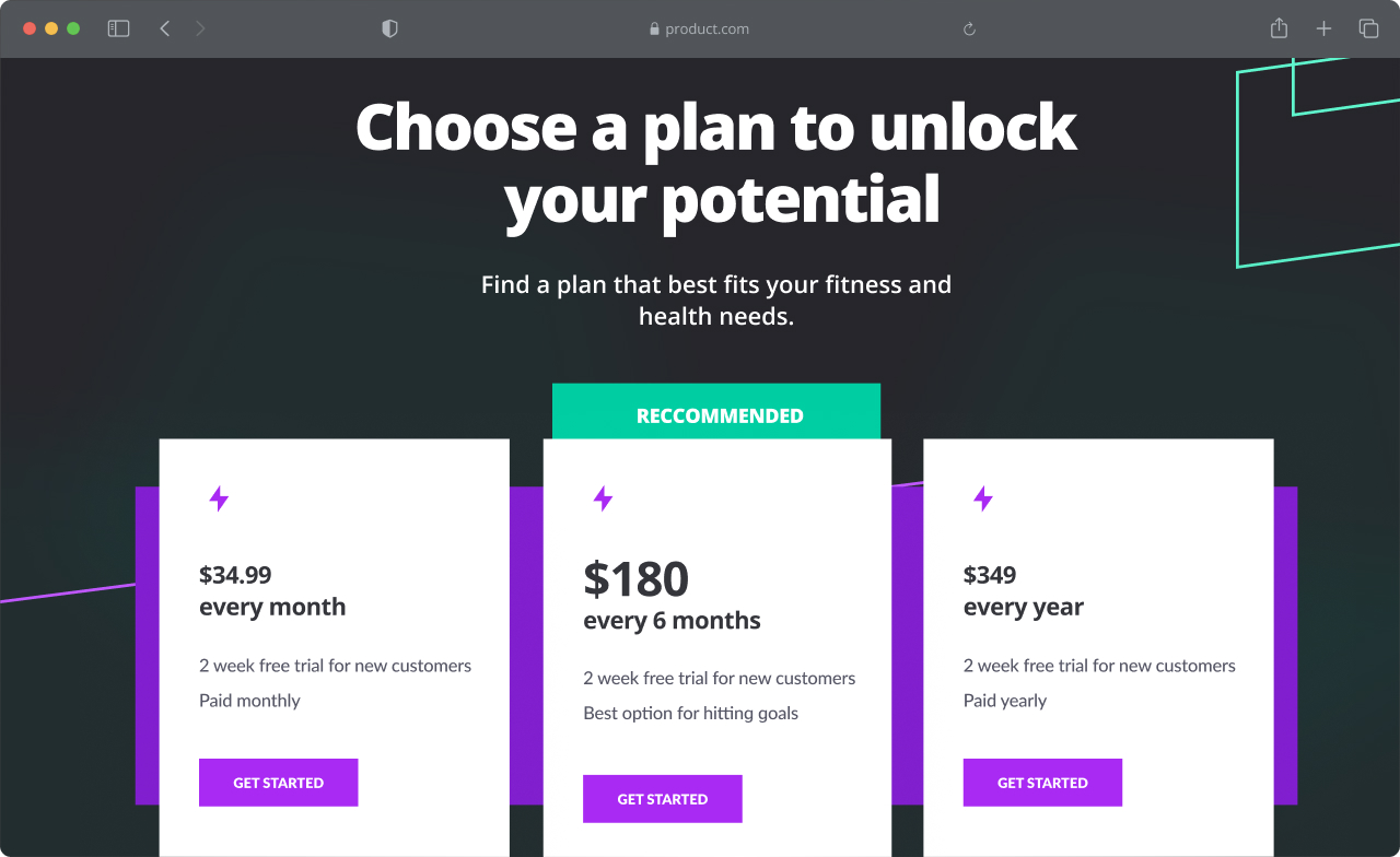
Final Design
I designed the subscription, account creation, and app download flows in Figma the Webflow parity in mind (e.g. Stripe integration). The result was a clear, visually engaging, and interactive rapid prototype that gave the client a tangible experience of the full user journey.


%20Intro.png)