Vroom Content Toolkit

Toolkit revamp improves new user content adaptation.
Role
Product Design Intern
Skills
Content Design
UX Design
Usability Testing
Duration
Jun - Aug 2022
(3 months)
Collaboration
Project Managers
Software Engineers
Vroom Leadership
Tools Used
Figma
Maze

Overview

The Problem

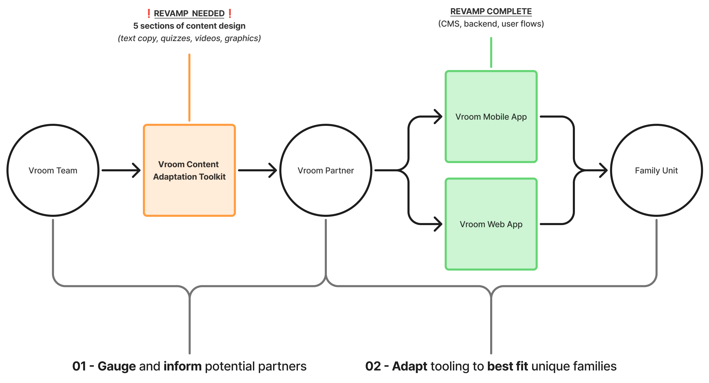
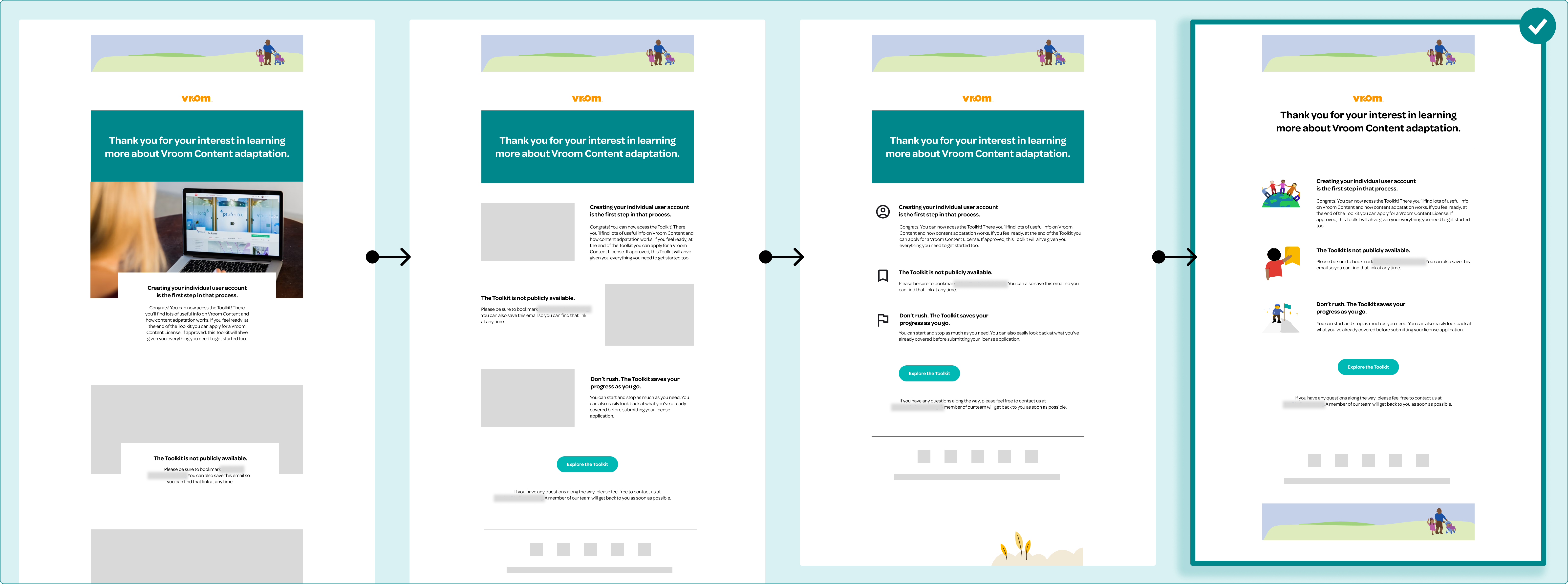
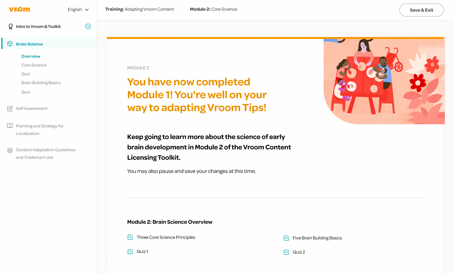
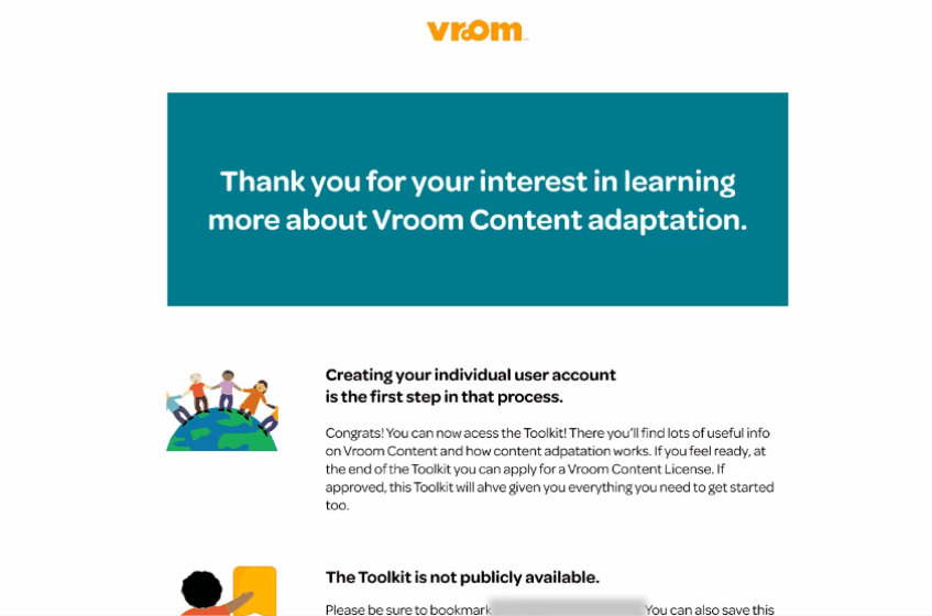
Vroom, a free early childhood development education program from the Bezos Family Foundation, has grown to support millions of global families since its 2014 launch. With 
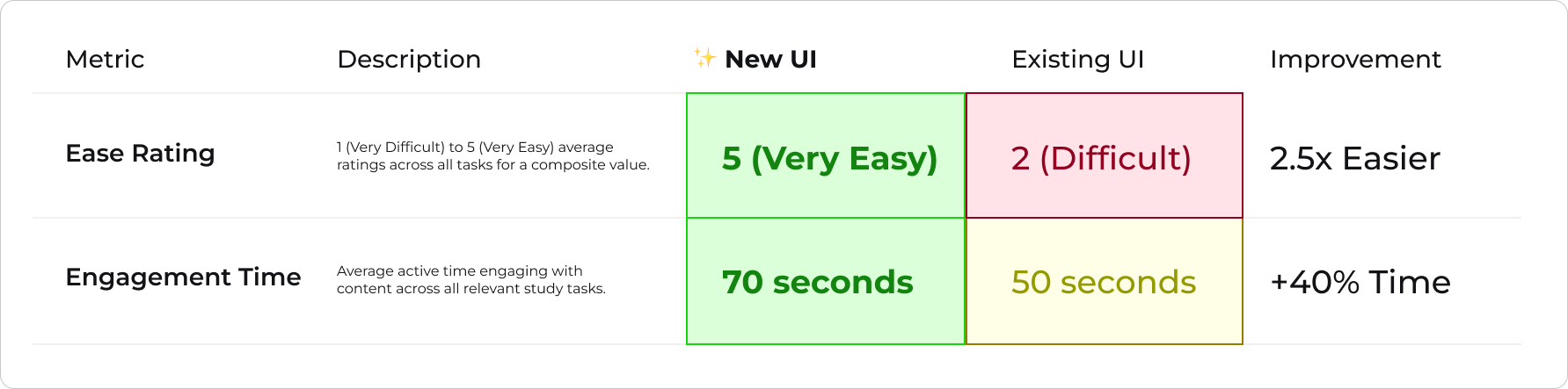
insufficient, static, and out of date material, a revamp of Vroom's content adaptation toolkit was essential to ensure an intuitive and engaging adaptation process for a larger, more diverse user base.

The Solution

I partnered with Vroom leadership + PM/SWE to transition and enhance toolkit content, building off an existing design system and content management system (CMS).

I created new pagination, dynamic layouts, illustrations, and an informative 'welcome' email to improve content engagement and understanding.

All my deliverables were successfully launched and actively used by Vroom.

Impact

$20K
SPRINT PROFITS
+40%
ENGAGEMENT TIME
3x
EASE OF USE
View Evaluation
OverviewContextHighlightResearchDesignEvaluationFinal DesignReflection

Context

Holistic Program Building

Substantial led the most recent build of Vroom's web + mobile services, equiped with insights into how to best revamp their toolkit to match.

The toolkit modules allow prospective Vroom partners (e.g. health clinics) to learn about the educational content Vroom includes, best adaptation methods, and quiz themselves to gauge understanding prior to service access.
The client's updated content offered a more informative experience for the expanded userbase. However, the volume and diversity introduced to an existing CMS and design system posed as potential friction to the transition.

Project Framing

Highlight

Before

I lead a UX evaluation of the original toolkit. The lengthy copy was static and clumped, with page navigation buttons fixed at the very top allowing users to easily skip content, causing high bounce rates and low user engagement.
I designed a more dynamic layout with improved spacing, clear information architecture, and visual aids, placing navigation at the bottom to support a more engaging and guided content experience. See Design section for more details.

Final Design

Research

I engaged in three initial client meetings to review original toolkit pain points alongside new toolkit goals and content documentation. I identified several themes to guide product strategy and design direction.
Content Volume
120 pages of text heavy content with poor spacing and visuals makes traversal and understanding difficult.
Low Engagement
Static and unclear displays with current navigation placement reduces content engagement.
Existing Systems
New content should remain inline with existing design language to ensure consistency across platforms.
,,
The content has evolved, and the toolkit should reflect that — it needs to feel current and true to Vroom, but also like something people want to spend time with, not just get through.
Vroom PM
,,

Product Strategy

Client Discussions

With these insights in mind, I proposed a strategy to best approach the design and testing phase to ensure launch success within our rapid 10-week timeline.

Design

Design Challenge
How might we transition the toolkit to new content while leveraging an existing content and design system to boost user engagement and ease of use?

Iteration

Drawing from these discussions, I proposed several ideas:
01. Dynamic Layout
Alternate content alignment, stagger text and visual elements, while harnessing whitespace to improve content navigability, engagement, and ease of use.
02. Adjust Navigation
Shift 'Next' button to bottom right corner of page while adding in in-app 'Back' options to boost navigation confidence, content transversal time.
03. New Elements
Create new visual elements such as on-brand illustrations, prominent CTAs, and a welcome email to elevate content engagement, satisfaction, and dynamism.

Ideation

Content-First Navigation

I repositioned the primary CTA to the bottom of each page to encourage deeper content engagement, while adding an in-app ‘Back’ option to support smoother, more confident navigation.

Strengthening Interaction Cues

I enhanced overall CTA visibility by replacing minimal, text-based prompts with custom illustrated elements, adding greater visual weight via color, depth, size, and center alignment to create a more clear pathway through the content and increase user engagement.

🚫Idea Deprecation

I played with left aligning the 'Next' CTA or creating a disabled state until the bottom of the page was scrolled to. However, the former did not follow users' natural reading path and locking content did not align with the foundation's ethics.

I also experimented with 'Download' CTA illustration and alignment, with earlier iterations lacking visibility and whimsical feel the client was looking for.
With only weeks remaining, I jumped into my team's Figma file. By leveraging existing elements while creating new components and digital illustrations, I created a mid-fidelity prototype for adjustment flexibility while converying realism.

Evaluation

Toolkit Prototyping + Testing

I ran 8 internal A/B tests via Maze, comparing the initial and revamped toolkit. I analyzed heat maps alongside time on task and ease ratings to validate the new UI prior to implementation. See key metrics below:

Welcome Email Coworking

I created several welcome email designs, experimenting with content type, size, and placement. I synched with one of our engineers to hone a design that would be easy to implement but still allowed for creative flexibility, arriving at my fourth iteration - a set of simple custom illustrations and text instructions.
Dynamic Modules
Alternating copy alignment and framed visuals improved navigation and comprehension, while illustrations added warmth and helped draw attention to key content.
Intentional Navigation
Moving the 'Next' button to the bottom guided users through content more intentionally, while adding a 'Back' option supported smoother, more confident navigation.
Welcome Email
A welcome email combined custom illustrations with clear, supportive language to thank users, set expectations, and guide them in using the toolkit with confidence.

Final Design

With evaluation complete, I arrived at a final high fidelity prototype ready for implementation. This design was launched and is currently live with private access for Vroom partners.
Landing Page
Phase Selection
Assessment Introduction
ECD Language Guide
Phase One: See The System
See The System Question One
See The System Question Three
See The System Question Four
See The System Question Two
Assessment Results

Reflection

Sprint Retrospective
This project was a success!🎉The revamped toolkit earned strong praise from Vroom leadership for its improved layout, visuals, and navigation.

By proposing a shared CMS workflow and streamlining design efforts, we saved $20K in costs — retained as profit.
What I Learned
Designing within constraints can be an opportunity — working within an existing system pushed me to be more intentional with layout, hierarchy, and pacing.

Small UX improvements — like reorganizing navigation or breaking up dense content — can have an outsized impact when grounded in real use cases and user needs.
Wave
EquityUp

Thanks for stopping by, feel free to explore my other projects!